
Minnesota State Parks
OVERVIEW
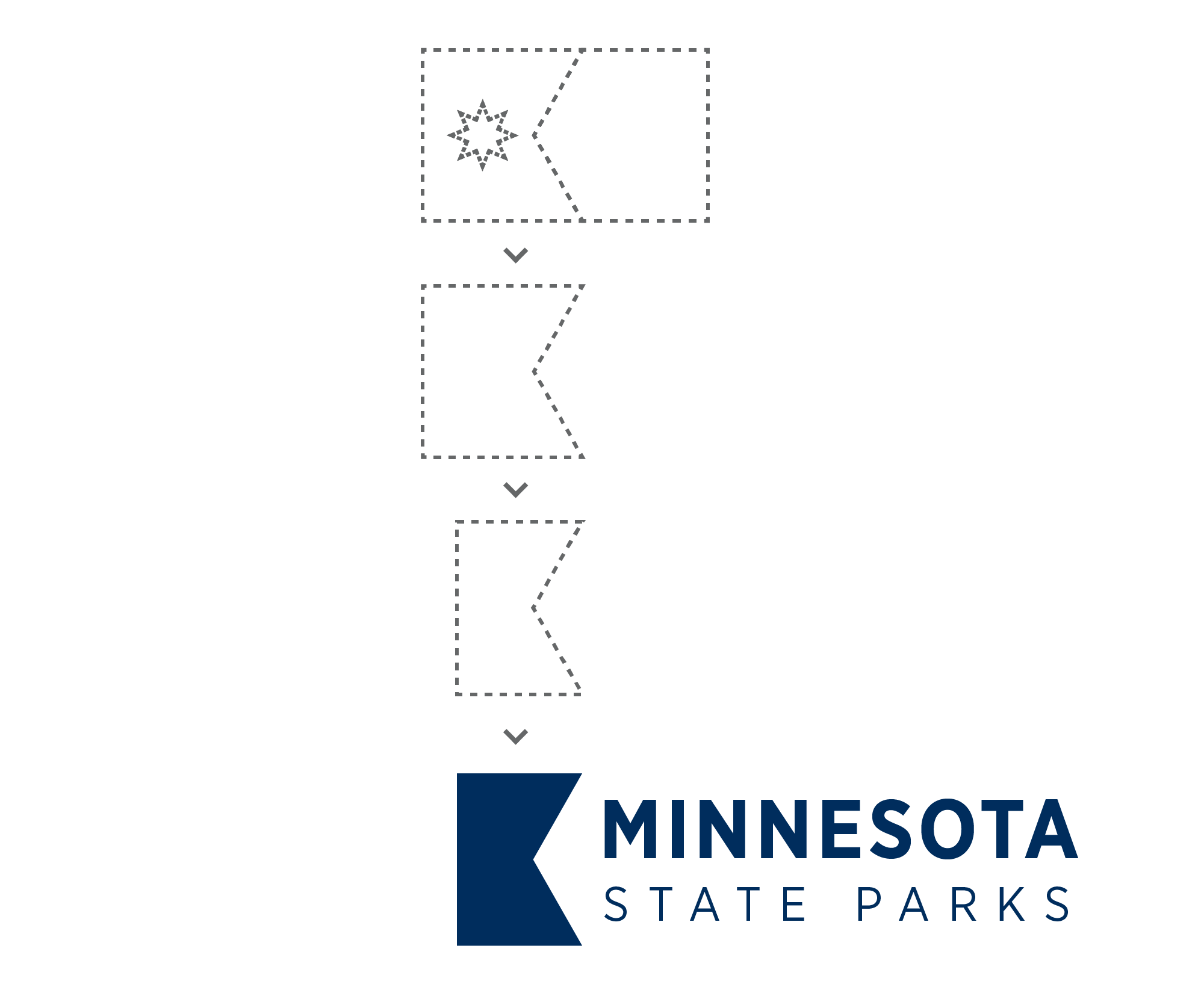
Minnesota’s state parks showcase incredible natural diversity, yet their visual identities remain inconsistent and disconnected. This rebrand introduces a unified design system inspired by the newly adopted Minnesota state flag. Using its clean geometry, modern symbolism, and color palette to create a cohesive visual language across signage, print, and digital experiences. The result is a refreshed, adaptable identity that honors Minnesota’s landscapes while guiding visitors through them with clarity and pride.
SERVICES
Creative Direction
Visual Identity Design
Wayfinding Design
Design System
Main Identity

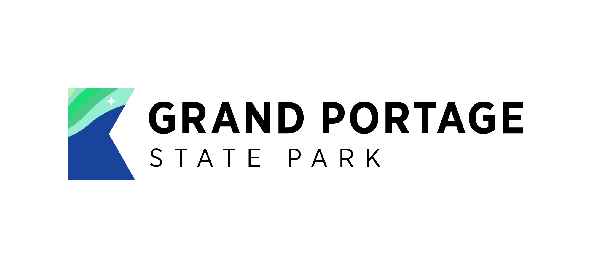
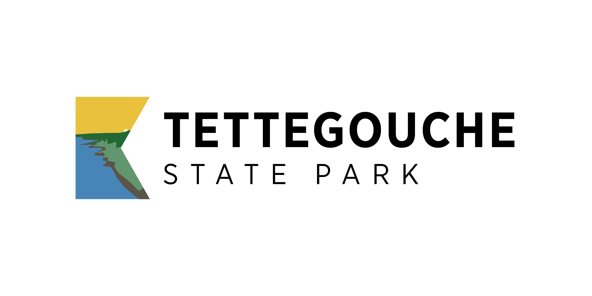
Use of the Frame Logo



Park Entrance Signage
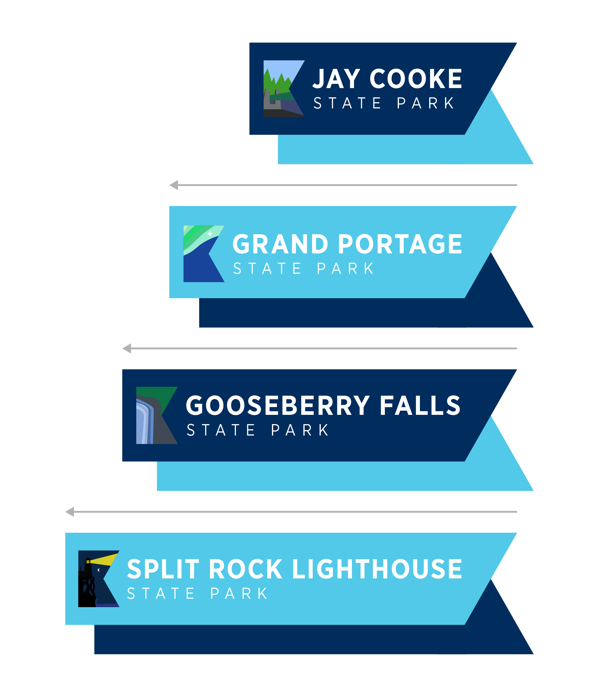
Expandability of Signage
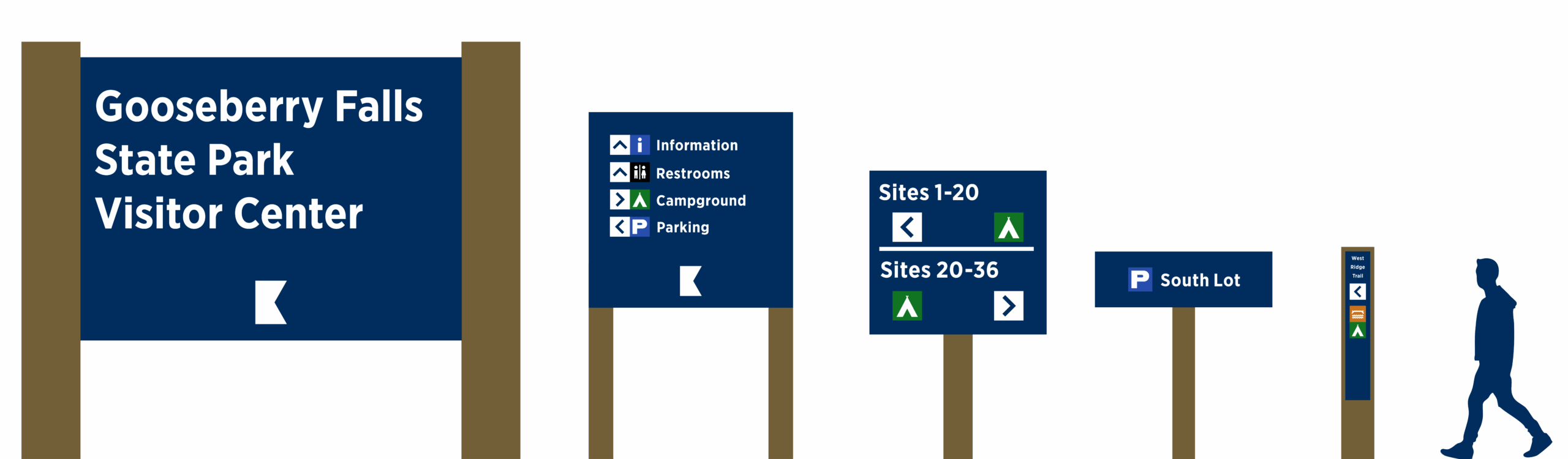
In-park Signage


Cole Hansen
Graphic Designer in Duluth, Minnesota